

Connected Health Data
Helping diabetic patients gain better correlation between their health and glucose data
Role
UX Design Intern
Context
Timeline
Jun - Aug 2024
Team
1 Design Intern (me!)
1 Design Manager
1 Project Manager
Disciplines
UI/UX Design
UX Research
Dexcom is a leading health technology company that manufactures, produces, and distributes continuous glucose monitoring (CGM) devices to over 1.7 million people with diabetes (PWD). Dexcom’s mission is to empower people to take control of their health.
The Dexcom G7 was approved in December 2022 by the FDA as a standalone CGM device and is currently the most accurate CGM in the US (as of Aug 2024). My project focused on expanding the breadth of offerings within the G7 by helping PWD gain better insight into the correlation between integrated health data and glucose data from their CGMs.
Tools
Figma
Sketch
Mural, Miro
UserTesting
As the lead designer for this project, I worked closely with different departments (UXR, Design, Content, Legal) to obtain design approval from stakeholders and prepare specs for a future implementation.
***As of July 2025, this concept has shipped! It’s now available in the Dexcom G7 and in Stelo by Dexcom.

CURRENT DIABETES MANAGEMENT
People with diabetes (PWD) live with the mental burden of diabetes every day. PWD (Type 1 + Type 2) have constant calculations, decisions, reminders, and alerts that are at the forefront of their minds. Diabetes management is both exhausting and frustrating. PWD want support and to better understand what is going well, what is not going well, and have their health care providers (HCP) kept in the know to help with treatment decisions.
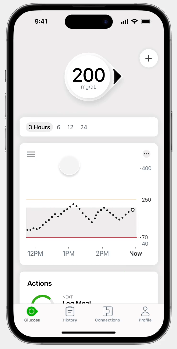
Dexcom’s G7 is a continuous glucose monitoring (CGM) system that provides real-time glucose data to help people with diabetes manage their conditions. PWD will typically place their CGM sensor on their upper arm or abdomen and use the G7 app to view their real-time data.
G7 SHORTCOMINGS
Despite G7’s ability to accurately capture glucose readings over time, there’s a lack of context and knowledge thereafter. A user will be able to see their exact glucose reading, but, after that, no further assistance is provided to the user, leaving a user to feel lost and question their next steps.
I was prompted to think about the holistic diabetes management experience:
“HMW provide correlation between glucose, integrated health data, and habit building tasks to support and engage Dexcom users through their diabetes journey?”

The G7 CGM lacks depth and isn’t as informative as PWD would like it to be


Core Features of the G7 CGM
I’ll be throwing around some CGM jargon here and there, so here’s some key features and functionalties within the G7:


RESEARCH
🧪 CGM Testing

I created an information architecture diagram of the “Glucose” tab within the app to better help me visualize how each feature within the app correlated with one other. I also highlighted particular areas I had difficulty navigating around, as well as any areas I identified as needing improvement.
🔍 Competitive Audit
I took a look at 4 other health management apps to uncover differentiating factors and common functionalities within health tools.
I was able to test out the sensor and the corresponding app to better understand the G7 CGM experience and the challenges PWD face navigating around Dexcom’s CGM system. (Surprisingly, application of the sensor wasn’t as painful as I thought it’d be.)
📚 Prior Research
I analyzed past research within the org regarding previous iterations of the G7 CGM, related studies on CGM features, and user segments.
⭐ App Reviews
I looked at App Store and Google Play Store reviews for the G7 and compiled feedback relating to user needs and wishes.
PWD WANT…
A personalized experience
PWD have differing health needs. A personalized health approach is needed to account for the varying ways users approach and understand their health data.
Guidance
PWD are too often questioning their past, present, and future actions. There should be greater opportunities to educate users on their actions to reduce any anxiety and promote more confident decision-making.
BUT CURRENT G7 EXPERIENCES ARE…
Not Benefical
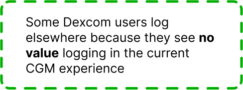
Features such as “event logging” aren’t heavily utilized by users as there’s no immediate or discernible feedback given to users, causing them to question their actions.
Difficult
There are UX/UI problems associated with the “trend graph” that make it difficult for users to view and understand their data.
We want to help PWD make the right health decisions in staying within their target ranges better and ultimately thinking less about diabetes. How can we achieve this?
“HMW provide a personalized health experience that reinforces PWD to undertake actions that support their diabetes journey?”
IDEATION
I decided to focus on the issue of event logging. This was a prominent feature within the app, but it remained severely underutilized. I hypothesized this feature had the potential to help users gain better insight into the correlation between integrated health data and glucose data from their CGMs.
I broke down the event logging phase into two parts: pre-event logging (before a user undertakes any action in the CGM at all) and post-event logging (after a user logs an event). From there, I used guiding questions to brainstorm different concepts that could address the issue at hand.

When it came to personalization, I referenced the app store reviews to understand what specific features users wanted personalization over. In evaluating the prioritization of personalization features, I had users rank how useful (on a scale of 1-7) each personalization feature would be.
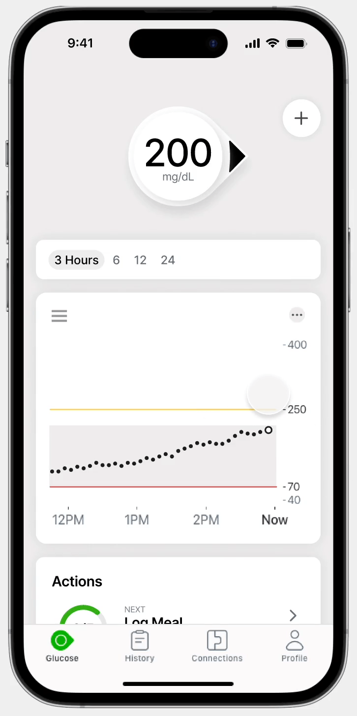
One of my ideas hinged on the idea of highlighting data within the trend graph and allowing users to gain more insight into the highlighted information. A common complaint about the G7 was that the interface was too plain and lacked visualization. Illustrating the relationships of data would add more visual cues to the user that allowed them to understand more about their health data.
ITERATIONS
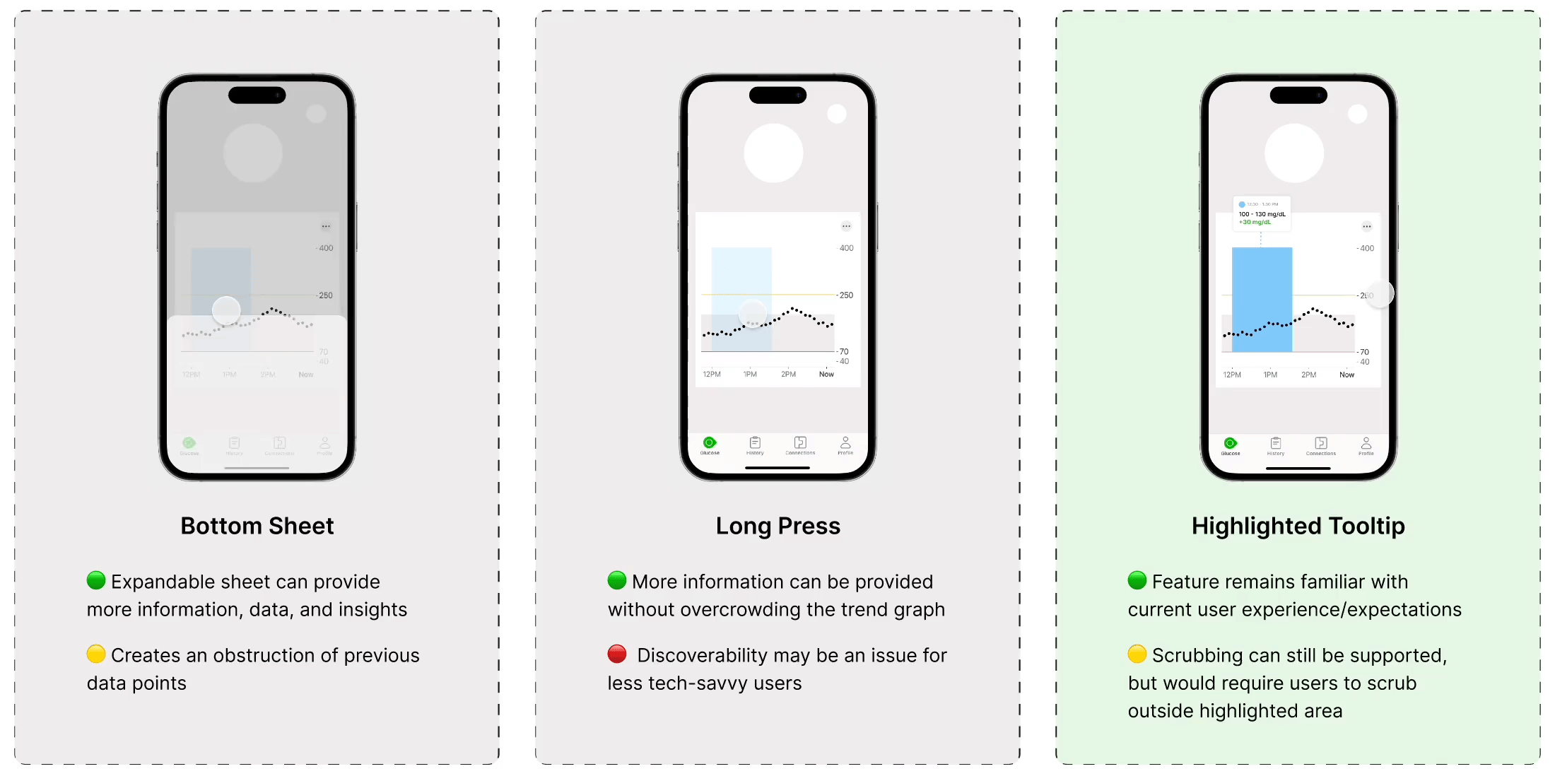
I generated different ideas for what the highlighted data might look like. In evaluating these concepts, I wanted to look at the awareness of the feature, how overlapping highlights might be presented, and the technical feasibility.
Through each iteration, I self-evaluated the pros and cons of each concept, as well as gathered feedback from team critiques and stakeholders.


I then took a closer look at how overlapping highlights might be presented. I experimented with different colors, hues, and saturations. I ultimately went with shades of blue as this was a color not seen elsewhere on the app, and therefore would not confuse the user. It also remains an accessible color choice for users with color blindness.

As the highlighted data is meant to be pressed, I explored the different UI interactions for how expanded data would be presented and compared these ideas against how the interaction plays into the current app experience.
VALIDATING CONCEPTS + IDEAS
After taking these iterations to team critiques to gather feedback, I then moved towards concept testing to validate the designs. Below is a screenshot of the concepts I presented to users.

My concepts sought to improve a part of the holistic app experience. As I came up with solutions, I considered the end-to-end process of what a diabetes patient typically goes through.
Highlight (Events, In Range Levels, Spike Changes): I hypothesized what within the graph a user may want to highlight and gather more information on. This includes (1) event logging, where users can highlight their logged events, (2) In Range Levels, where users can highlight areas of the graph in which they fell outside their in-range levels, and (3) Spike Changes, where unusually large differences in glucose readings are highlighted for the user.
Actions Log + Recommendations: The goal is to provide users with task reminders to encourage users to be more mindful of their actions and utilize event logging more frequently. Further recommendations, such as predictive glucose readings and action items, are given to users after they interact with the app in any way.
I conducted 6 concept testing interviews (five T1, one T2) with G7 CGM users, trying to understand their current CGM experiences and capturing their thoughts on the design concepts. In particular, I wanted to:
Understand best trend graph practices and expectations of the current CGM experience
Understand what type of data users want more insight on within their trend graph
Understand what aspects of personalization should be prioritized, if any
UXR FINDINGS
PWD want reassurance
Despite varying years of CGM knowledge and experience, people still want to be reminded about actions to take, even if they already are aware of what steps to take. For something as important as health, prompts and reminders aren’t seen as nuisances, but rather a reassuring reminder.
↳ The “Actions Log + Recommendations” concept would be beneficial to users as these concepts provide more reassurance to users compared to their current guesstimations
PWD want to extrapolate data from their CGMs that isn’t inherently visible
When it came to understanding what particular data users wanted to highlight and expand upon, users expressed the desire to see something they couldn’t immediately see for themselves. Aspects such as “In Range Levels” and “Spike Changes” were already apparent to users; highlighting those areas wouldn’t provide any additional insight.
↳ The “Highlight: Events” resonated with most users as they could view their event impacts in an illustrative format, something not currently possible on the G7. While users with a longer history of diabetes would have a better idea of how different events impact their health, for newer diabetic patients, the learning potential would be much greater
The journey map below illustrates how the design concepts tie into the experiences of PWD. While the solutions mainly address the pre-event and post-event logging experience, a recurring idea brought up in testing was the expansion of cross-app integration with the G7, which could address the during-event logging phase.

The research study also revealed the customization priorities. Data scrolling, dark mode, and adjusting the line width/color within the trend graph were the most desired customization features. I took these findings to stakeholders to establish future priorities.
SOLUTION
Highlight: Event Logging
Event impacts are highlighted to provide visual depictions of the event impacts on a user’s glucose levels
Event highlights reduce the mental calculation users have to do when viewing their health data over time

Actions Log + Recommendations
SOLUTION
Personalized actions log provide users with the framework to better manage their diabetes
Feedback loop provides actionable insights and recommendations for present and future actions

Closing
Working in the health tech industry was a first for me, and it was both challenging and rewarding. Not only is there an abundant amount of regulatory compliances within the healthcare industry, but there’s also a wide subset of users to account for that can make designing workflows complex. However, knowing you’re designing something that impacts the lives and health of others is truly rewarding. It’s been such a privilege to be able to contribute to the success of a CGM that is used by millions.